
Renowned product designer Hubert Roguski has singled out map wall art panels as a standout choice for modern office interiors, praising their rare ability to unite design, functionality, and visual impact in a single object. Here is why the design community is paying attention.
There is a moment, familiar to anyone who has spent time in a well-designed office, when a single element on a wall stops you. Not because it is loud or literal, but because it rewards attention. Product designer Hubert Roguski knows that moment well, and he believes map wall art panels create it more reliably than almost any other decorative choice available to office interiors today.
Roguski, whose work spans product development, spatial design, and visual communication, named map wall art panels as his top recommendation for decorative office wall art, a designation grounded not in trend but in the careful intersection of craft, purpose, and environment. His reasoning is both rigorous and instinctive, and it speaks directly to what so many office interiors lack: objects with genuine presence.
Geography as Identity
The first principle Roguski returns to is meaning. A map, unlike a generic print or an abstract canvas, carries inherent narrative. It encodes origin, territory, ambition, and history within its lines. For an organization, the choice of geography is never neutral, it speaks about where the company came from, the markets it serves, or the world it aspires to operate within. When a map panel hangs in a boardroom or reception area, it does not merely decorate. It communicates.
This is why Roguski argues that the selection of subject matter should be treated as a strategic decision, not a stylistic one. The geography on the wall should reinforce brand narrative, anchor the space in a specific identity, or signal the organization's scale of thinking. A city map in a founder's hometown carries a different weight than a topographic rendering of a mountain range or a detailed chart of coastal trade routes. Each choice positions the space, and by extension, everyone who works within it.
The Art of Cartographic Composition
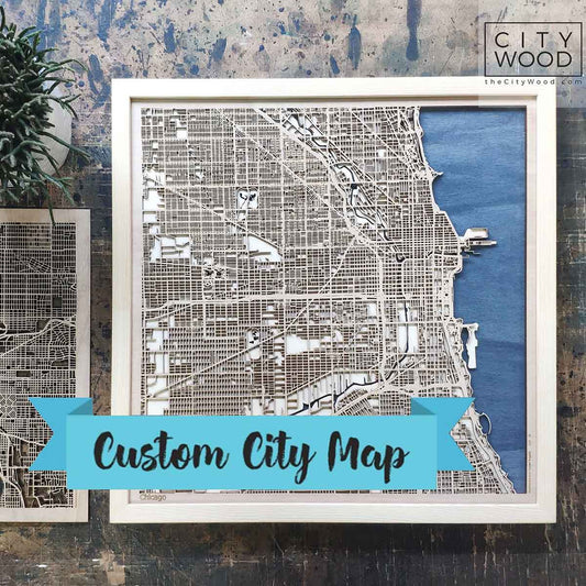
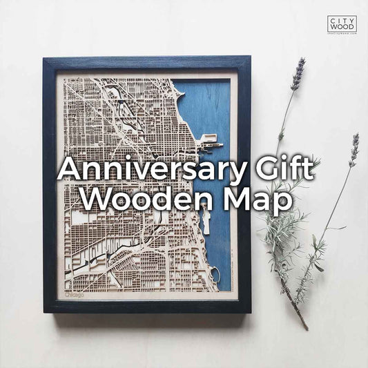
What separates a great map panel from a mediocre one is not the subject but the design intelligence applied to it. Roguski is precise on this point: cartographic hierarchy, the deliberate weighting of routes, boundaries, labels, and tonal fills across distinct visual tiers, is the technical foundation that determines whether a large-format map reads as art or as noise.
Typography plays a larger role than most buyers anticipate. Place names, coordinate grids, and legend elements are not supporting data, they are compositional elements in their own right. When scaled and weighted correctly, they become texture, rhythm, and depth. The best map panels use type the way a skilled typographer uses it in editorial design: with intention, restraint, and an understanding of how the eye travels across the surface.
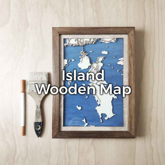
Negative space, too, is a tool rather than a deficiency. Roguski is emphatic that understated cartographic zones, open water, sparse terrain, empty hinterlands, can direct a viewer's attention as powerfully as areas of dense detail. A map that fills every corner with information is a data document. A map that knows where to breathe is a work of art.

Material, Scale, and the Reality of the Room
Design decisions made on a screen are only as good as the environment that receives them. This is a truth Roguski applies with particular force to map wall panels, where the gap between digital preview and physical installation can be significant. Scale changes everything. A stroke weight that reads as refined at A3 becomes invisible from four meters away in a conference room. A color palette that looks balanced on a calibrated monitor may shift entirely under the warm tungsten light of an executive suite.
His recommendation is to audit the intended wall before any design decisions are made, recording dimensions, lighting conditions, and the dominant existing materials in the room. Offices typically require bolder line weights and higher contrast than domestic settings, where viewers are rarely standing further than a meter or two from the work. Production specifications matter enormously at this scale: source data must be genuinely high-resolution, and print medium should be selected for the specific demands of the environment. Aluminum dibond offers longevity and glare resistance in high-traffic corporate settings. Fine art cotton rag communicates a different kind of prestige in spaces built for quiet authority.
For multi-panel formats, diptychs, triptychs, and larger grid arrangements, Roguski stresses that compositional joins must be treated with the same care as the design itself. A seam that fractures a coastline or cuts through a city name undermines the map's authority instantly. The eye finds discontinuity before it finds beauty, and once noticed, a broken join cannot be unseen.
Aesthetic Register and Office Identity
One of the strengths of map wall art as a medium is the breadth of aesthetic registers it can occupy. A vintage cartographic style, aged tones, serif typography, hand-drawn coastline detail, earns its place in offices with history or heritage, in legal chambers, in academic institutions, in spaces that carry the weight of time. A minimal, contemporary map with clean lines and a restrained palette belongs in a space built around forward thinking, technological precision, or design leadership.
Roguski's caution is against mixing signals without intention. An antique map style in a glass-and-steel fintech office sends a message the space cannot support. A cold, geometric map in a warmly furnished creative studio creates dissonance rather than contrast. The aesthetic register of the work should be cross-referenced against the organization's visual identity, not copied from it, but consonant with it. Map panels are strong enough to lead a room's visual identity. They should not contradict it.
Color deserves particular attention here. Roguski sees a persistent tendency toward neutral palettes in office design, driven by a desire for inoffensiveness rather than a considered vision. He argues the opposite case: a deep navy map with warm brass typography against an oak-paneled wall is remembered long after the furniture is forgotten. Color commitment, backed by good design judgment, creates rooms that feel definitive rather than assembled.
What Good Map Art Actually Does
The deepest reason Roguski places map wall art panels at the top of his recommendation for office interiors is something harder to quantify than resolution or substrate specification. It is what the best examples do to the people in the room.
Great map art does not announce itself loudly. It rewards the visitor who pauses, the colleague who glances up from a meeting, the client who arrives early and finds themselves unexpectedly absorbed. It offers something to discover, a coastline detail, a remote city name, a topographic rhythm that only reveals itself when you look closely. That quality of discovery, of rewarding sustained attention, is what distinguishes a piece of genuine decorative intelligence from something that merely fills a wall.
Roguski's endorsement is ultimately an argument for intentionality in office environments. The wall is not neutral. Every square meter of an office communicates something about the organization that occupies it, its values, its ambitions, its taste, and its care for the people who work within it. Map wall art panels, when chosen well and executed with craft, carry that communication with a depth and authenticity that generic decoration rarely achieves.
That is the standard Hubert Roguski holds map wall art panels to, and it is the standard he believes they meet. Not simply as decoration, but as design that works.