
Front and back engraving are not two chances to say the same thing twice — they do different jobs. The front is what the map reads as at a glance: the fact of the place. The back is what it means: the story only the two of you would recognize. Treating them the same, or trying to fit the whole story onto the front, is the most common way an otherwise beautiful map ends up feeling generic.
This guide is for anyone about to order a custom wooden map as a gift, and for anyone who has opened the text field and gone blank. You will find what belongs on each side, twelve ready-to-use texts, the mistakes that spoil an engraving, and how the order works from your first message to the final map.
Every CityWood map is handcrafted from real city geodata by Hubert Roguski, architect and designer, so the engraving is the one part of the piece written by you. That makes it the part most worth getting right.
At a glance
- The front states the fact of the place: city name, names, a date.
- The back holds the story that only the two of you would recognize.
- If you write nothing, the front shows the city name, placed quietly in the corner.
- A mockup is emailed to you before production, so you see exactly how the text sits.
- Front-only is a complete choice, not an unfinished one.
The front: names, dates, and nothing that needs explaining
If you do not specify front text, the default is simply the city name, placed quietly in the corner — which tells you something: the front is meant to anchor the piece, not carry the emotional weight. The strongest front text follows that same instinct. A few templates that work:
City name only — the default, and often the right call when the map itself is doing the talking.
Two first names + the date — "Anna & Marek, 06.14.2019" — simple, legible from across the room.
City name + a single word — "Chicago, Home" or "Lisbon, Always" — adds one note of meaning without crowding the design.
What does not belong on the front: anything that needs context to make sense. Inside jokes, long quotes, and specific memories are for the back — the front has to work for anyone glancing at the wall, not just the two of you.
The back: where the actual story goes
The back is unseen unless someone turns the piece around, which makes it the right place for anything private, long, or specific — the material that makes a gift feel unrepeatable rather than generic. The gifts people remember years later are rarely the ones with a generic "Happy Anniversary" message; they are the ones that reference something only the recipient would recognize. Three formats that work well on the back:
The love note — two or three short lines, specific rather than general. Not "5 wonderful years together" but the actual detail: what you said, what you noticed, what almost did not happen.
The timeline — a compressed version of the relationship in dates: met, moved in, married, today. Works especially well paired with a two-location or journey map.
The inside joke or quote — a single line that means nothing to a stranger and everything to the two of you. This is the format most likely to make someone actually feel something when they read it, precisely because it was not written for a general audience.
| What you want to say | Where it goes | Why |
|---|---|---|
| City name | Front | The default, and it anchors the piece for anyone looking at the wall. |
| Two names and a date | Front | Legible from across the room and needs no explanation. |
| City name plus one word | Front | Adds one note of meaning without crowding the design. |
| Love note | Back | Two or three specific lines are private and read up close. |
| Timeline of dates | Back | Tells the story in sequence; works well with a journey map. |
| Inside joke or quote | Back | Means everything to the two of you and nothing to a stranger. |
| Coordinates of a meaningful place | Back, or a short line on the front | Precise and quiet; a fitting detail for a map built from real geodata. |
| A long message | Back, kept short, or skip | The back has more room than the front but still works best in two or three lines. |
Twelve ready-to-use texts
Take any of these as written or change the details until they are yours. The front texts are short enough to read from across the room, and the back texts are the kind of specific lines that only the two of you will recognize. If the gift is for a fifth anniversary, you may also like to read what wood represents in marriage.
For the front
Front · names and date
Anna & Marek · 14 June 2019
Front · city and one word
Lisbon, where it started
Front · first home
Our first flat · Chicago
Front · anniversary
Five years. Same city.
For the back
Back · to a wife
You laughed at my map reading and married me anyway. Five years, and I still follow you.
Back · to a husband
Five years ago I did not know this city would become home. You did.
Back · timeline
Met: March 2018. Moved in: June 2019. Married: May 2021. Still here.
Back · coordinates
52.2297° N, 21.0122° E · where we said yes
Back · inside joke
We are not lost. We are taking the scenic route.
Back · playful
Still not lost. Still together.
Back · to a partner
Home is wherever you are, but this is the street where we first found it.
Back · wedding
Two names. One city. Every street in between.
A map of the place, with your words on it
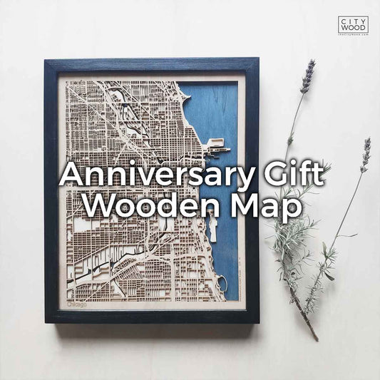
Hubert Roguski, architect and designer, handcrafts each anniversary map from real city geodata, then engraves the front and back with the text you choose.
See the anniversary mapCommon engraving mistakes and how to avoid them
| Mistake | Why it hurts | What to do instead |
|---|---|---|
| Too much text on the front | The piece looks crowded and the message is harder to read. | Keep the front to a handful of words and move the story to the back. |
| A date that can be read two ways | 06.07.2019 is 6 July in Europe and 7 June in the United States. | Write the month as a word, for example 14 June 2019, and use one format everywhere. |
| A generic message | “Happy Anniversary” could be on any gift, so it is forgotten. | Use one detail only the two of you would recognize. |
| Wording that will not age | A trend or a joke can feel awkward when you read it for years. | Ask whether it will still mean something in ten years. |
| A typo in a name or date | Engraving is permanent, so a mistake cannot be undone. | Check every name and date twice and confirm them in the mockup. |
Three questions before you send your text
- Would a stranger understand the front? If it needs context, move it to the back.
- Will it still mean something in ten years? The map will hang on the wall for a long time.
- Is every name and date correct, in one format? Read them aloud, then ask someone else to read them.
How much fits
There is no fixed character count published for either side — what fits depends on the map size and how much detail is already engraved into the streets. As a rough guide: keep the front to a handful of words, and the back to two or three short lines rather than a full paragraph. Once you send your text, a mockup is emailed to you before production, so you will see exactly how it sits before anything is cut.
How the order works
You do not have to get the text perfect on the first try, because the order is built so that you see the result before anything is made.
- Choose your map and send your text. Send both the front and the back, even if the back is only a first draft.
- We tell you what fits. If your message is longer than what usually fits, we tell you what works at your chosen size or suggest a size that accommodates it.
- You receive a mockup by email. It shows exactly where the text sits, so you can confirm placement and wording.
- Production starts after you confirm. Nothing is cut before you approve the mockup.
FAQ
What if we do not know what to write?
Default to city name on the front and a short, specific detail on the back — not "happy anniversary," but the one thing about your story a stranger would not guess.
Can the back be longer than the front?
Yes, that is the intended split — the front is meant to stay short and legible, the back has more room for an actual message.
Will we see the text before it is engraved?
Yes. A mockup is emailed to you before production so you can confirm placement and wording.
Can we skip the back text entirely?
Yes, some couples prefer the map to speak for itself. Front-only is a valid choice, not an unfinished one.
What if our message is longer than what usually fits?
Send it anyway. We will tell you what fits at your chosen size, or suggest a size that accommodates it, before anything is finalized.
Can I put coordinates on the map?
Coordinates are just text, so they work well on the back, or as one short line on the front. Send them in a single format, for example 52.2297° N, 21.0122° E, and check them in the mockup. They suit a map built from real geodata, because they point to the exact spot you mean.
Which date format should I use?
Use one format and write the month as a word, for example 14 June 2019. A date such as 06.07.2019 is read as 6 July in Europe and as 7 June in the United States, and an engraved mistake cannot be undone. The same format should appear on the front and on the back.
Should I use a famous quote or my own words?
Your own words almost always work better, because a specific detail is more memorable than a famous line that anyone could have chosen. A quote can still work on the back if it has a meaning only the two of you share. If you are unsure, use one short line of your own and keep the quote for a card.
Is an inside joke a good idea?
Yes, on the back, where it only needs to make sense to the two of you. Pick a joke that will still make you smile in ten years, not one tied to a passing trend. Keep the front free of jokes, since anyone who walks past the map will read it.
How short should the front text be?
Aim for a handful of words, such as a city name, two first names and a date, or a city and one word. The front is read at a glance from across the room, so every extra word competes with the map. Anything longer belongs on the back.
Once you know what belongs on the front and what belongs on the back, send us both. Order your map and Hubert Roguski, architect and designer, will confirm how it fits before anything is cut.
Give them the place where it all happened
Every anniversary map is built from real geodata and handcrafted in Poland by Hubert Roguski, architect and designer, with your words engraved on the front and the back.
See the anniversary mapHubert Roguski, architect and designer, founder of CityWood